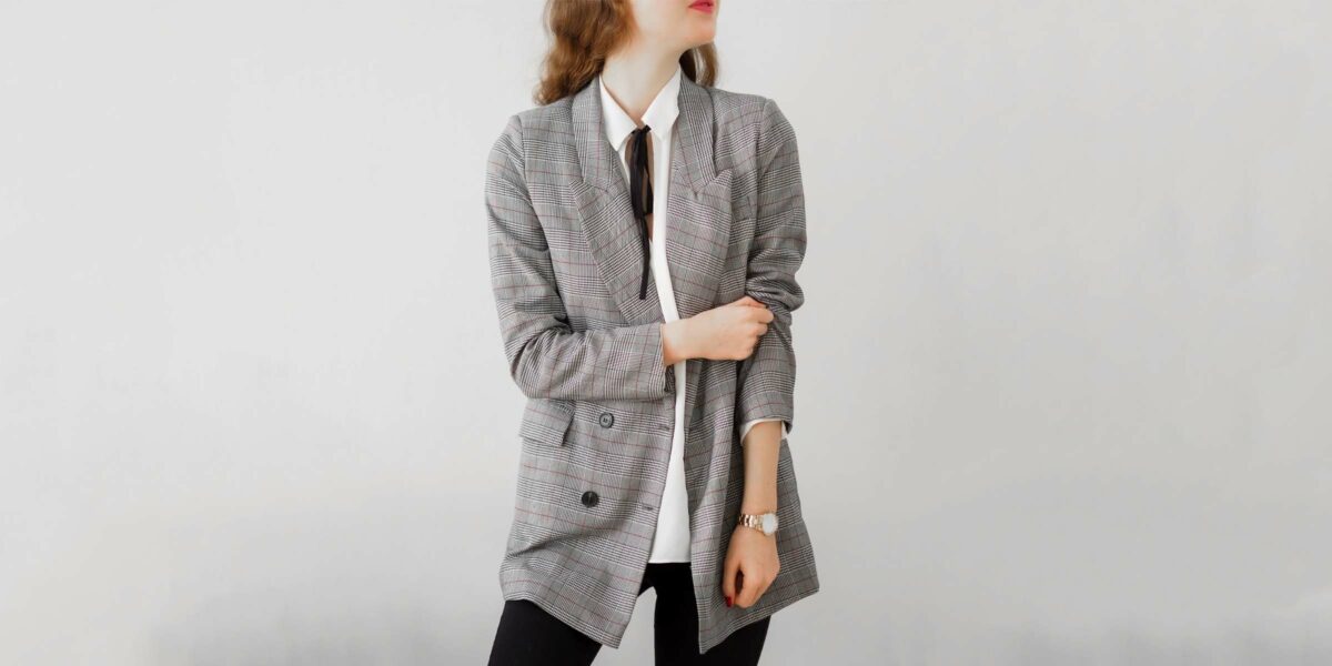
Color: a sartorial language in itself.
An empowering red lip can go a long way in boosting confidence (just try it for your next interview.) Whilst neutrals send out a more approachable message, Black on black is the universal code for mourning—unless you’re French, and then it’s just a prerequisite. And as pointed out by the dopamine dressing trend, bright hues hold the power to uplift moods and spread positivity.
But choosing what to wear is more than just sending a message to others. It’s also important to consider what makes us—the wearer—feel good. And whilst comfort is key to feeling good, so is color. The right colors have the uncanny ability to harness your natural beauty by harmonizing with your skin tone and radiating a natural glow. Whilst poor color choices just as easily have the opposite effect—doing little justice to our distinguishing features.
In saying that, there are no hard and fast rules when it comes to fashion and much of what we wear is based on intuition. We have some seasons where specific items practically jump off the mannequins and into our carts. And we have others where we feel a lot less inspired when it comes to editing our wardrobes. Acknowledging what colors make us look and feel fantastic in those less-inspired seasons can be incredibly helpful. And understanding what colors go well together using color theory and the color wheel for clothes allows us to feel confident in trying.
We’re saying goodbye to styler’s block (the inability to string two pieces together.) And with our ultimate guide to good color combos in clothing, we’re bringing in a colorful wardrobe of fashion-aficionado-approved styling possibilities.
Color Theory
For many of us, knowing what works comes naturally. And if that’s you, you may be surprised to learn that there is actually a science behind matching colors. And if that’s not you, you are likely relieved to hear that Color Theory can be applied by anyone when it comes to styling.
Color Theory is a set of guidelines for choosing good color combinations, drawing on color harmony, color temperature, and color context.
Color harmony draws on visual order to determine aesthetic color palettes and color schemes that are perceived as balanced.
Color temperature experiments with warm and cool colors to deliver the desired effect.
And color context emphasizes how colors behave differently in different environments. For example, burnt orange seems subdued placed next to a bright yellow, but appears much brighter paired with cobalt blue. In the same way, different colors reflect differently on different skin tones.
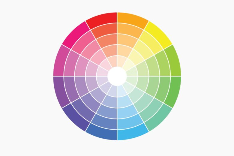
Color Wheel
Invented by Sir Isaac Newton in the 18th century, the color wheel is a visual representation of the relationship between colors in the color spectrum. Newton’s color wheel consisted of the seven rainbow colors, although Johann Wolfgang von Goethe eliminated indigo in 1810 to develop a symmetrical wheel with just six colors. This is the color wheel we know and use in various industries today.
Designers and stylists have used the color wheel for clothes for centuries. But it can also be used by anyone to understand how to curate a capsule wardrobe and how to mix up your outfits from one day to the next. If you want to keep it elegant and refined, you may opt for monotonous hues or analogous colors. And if you’re feeling bold, using the color wheel to match complementary colors is a fun way to spice things up without compromising sophistication.
Primary Colors
What are the primary colors? Red, Yellow, Blue. No two colors can be mixed to achieve these shades and so we refer to them as primary colors. But these basic colors aren’t taught in kindergarten for no reason. The three primary colors form the foundation for all colors. And knowledge of how they can be mixed to achieve various shades can help us understand colors that look good together and colors that don’t.
Primary colors in their truest form are bold by nature, so they are typically used for impact or as accent colors.
Secondary Colors
Secondary colors are derived from a combination of primary colors. The secondary colors are Orange, Purple, and Green. Orange derives from a combination of red and yellow. Purple derives from a combination of red and blue. And green derives from blue and yellow. In short, the three primary colors and three secondary colors together make up the six colors in the color wheel.
Like primary colors, secondary colors can be mixed with black and white to create lighter and darker hues. But in their truest form, the bright color palette can also be used to liven up an outfit.
Tertiary Colors
Tertiary colors are a combination of primary and secondary colors, and they are often where the real magic happens. Although they don’t feature on the color wheel, many brands use tertiary colors to create signature looks such as Hermes’ Rose Bubblegum Pink or Gucci’s Bangladesh Green.
The tertiary color palette includes commonly worn hues such as mint, aqua, teal, and corals. These “pretty colors” often mark one season in fashion from the next. They are also usually less obvious iterations of primary and secondary colors, and as a result, they can be less intimidating to wear for minimalist dressers.
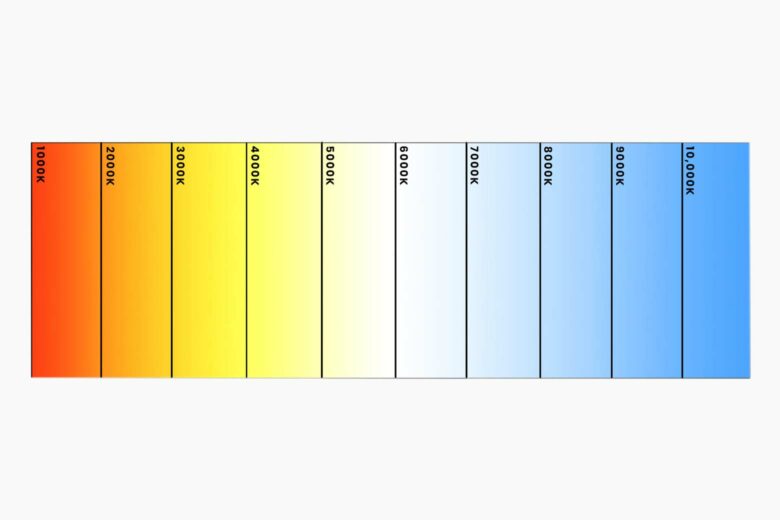
Color Temperatures
Besides mapping out primary colors and secondary colors, the color wheel also distinguishes warm colors from cool colors. Understanding this difference is particularly important in determining colors that go together and how they should be worn by each individual.
Warm Colors
Warm colors include hues like red, orange, and brown. In short: anything that makes you think of warm sunsets and fireplaces is likely a warm color. Warm colors often make things appear smaller in size, and they are notoriously adopted to slim down silhouettes.
With the resurgence of Y2K fashion, warm colors such as brown are having a moment, especially when paired with lighter blues and pinks. So this could be a simple way to add some color without totally reinventing your wardrobe.
Cool Colors
Soul-stirring and effortlessly soothing, cool colors are often seen as a breath of fresh air. Reminiscent of water, skies, and snow; blues, greens and purples are often used in interior design to open up a space and evoke a calm environment.
Similarly, they can do the same for our everyday looks. Whether it’s a Gen Z green purse, soft lilac scarf, or confident cobalt blue shoe, you certainly won’t feel frumpy by adding a touch of cool to your ensemble.
Neutral Colors
Often used as a vehicle to showcase accent colors, neutrals are very effective when it comes to carefully curating a capsule wardrobe. The key to any capsule wardrobe is collecting items that can easily be mixed and matched to generate a variety of ensembles. Naturally, neutrals play a big role in achieving this, but they shouldn’t be overlooked as statement pieces in themselves.
A white maxi dress is often a show stealer in Summer, whilst toned-down linens give off an air of effortless sophistication. Of course, every woman needs an LBD. And satin champagnes are timelessly elegant.
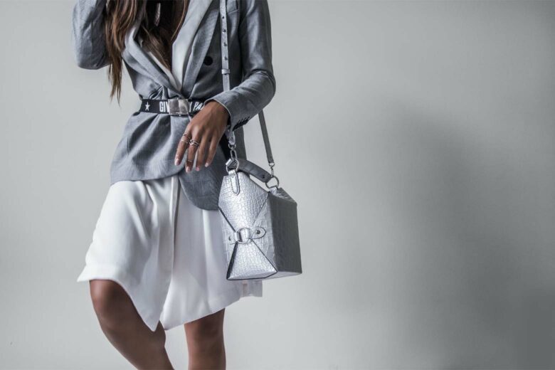
How to match colors to achieve the perfect color combination in your outfit
The principle rule for assembling an outfit is combining colors that work in harmony. And whilst that may sound obvious, harmonizing colors needn’t be as simple (or boring) as matching your belt to your shoes. There are many ways to achieve good color combinations to achieve varied styles. For example, the same pink top takes on a whole new meaning with a Y2K purple skirt or matching pink shorts as it does with casual denims or a bright red jacket.
But when being bold, how do we know when it’s a fashion hit or miss? These simple guidelines are a good place to start:
Analogous
Perhaps the most simple and failsafe way to achieve good color combinations is analogous matching. Analogous colors are next to each other on the color wheel and share a common hue. Therefore, they naturally blend well together and are easy on the eye.
Analogous outfits tend to be more subtle and understated, making them a go-to for dressers who prefer to stay out of the limelight. Don’t know where to start? Pick a color that you feel comfortable wearing and then look at the colors on either side of it on the color wheel. Think about how you could incorporate them in a coat, bag, or other various accessories. Simple right?
Complementary
Color blocking: if ever there was a time to try it, it’s now. According to our Instagram feeds, color blocking is having a moment. And therefore so are complementary colors.
Complementary colors are contrasting colors, found exactly opposite each other on the color wheel. When paired together they highlight each other, creating a sense of drama and empowerment. A favorite amongst celebrities like Kim Kardashian and Harry Styles, the use of bright colors such as blue and orange can be incredibly striking. But if you’re just dipping your toes into the water of dopamine dressing, using muted tones such as teal and mustard yellow is an easy way to test the trend.
Monochromatic
Who doesn’t love a full fuschia pink suit? Or a green on green on green ensemble? Monochromatic outfits always look put together, creating an elongated look that screams “in-the-know fashionista.”
However, monochromatic outfits aren’t as easy to pull off as they appear to be. For maximum effect, you want to wear the same shade of color from head to toe. If you don’t have anything in your wardrobe that works, we suggest looking at matching suits to start. They always look polished and refined. And you can have fun with color or play it safe with neutrals.
Neutral
Ah, neutrals—every minimalist’s clutch and every dopamine dresser’s demise. But they needn’t be considered simple or boring. Neutrals are a great vehicle for working with brighter colors. And because they pair well with almost everything, they make up a good portion of our capsule wardrobe collection.
Neutrals are timeless and versatile. This makes it easier to invest in high-quality pieces from luxury labels, accenting them with seasonal colors and bolder accessories. Neutrals also work fantastically together to create an effortlessly elegant aesthetic.
Triadic
Already tried your hand at complementary color blocking and feeling bold? Triadic color combinations take the concept one step further by adding in a third.
Triadic colors are equidistant from each other on the color wheel. So if you place an equilateral triangle anywhere in the middle of the wheel, the three vertices will point to your three triadic colors. Because they are equidistant from each other, they balance each other to create harmony. Again, if bright colors are too OTT for you, you could consider muted shades such as olive green, pastel pink, and powder blue.
Accent
Neutral shade lovers rejoice: accent colors are a great way to spice up your ensembles without totally neglecting your comfort zone.
Think of your LBD with a bright red kitten heel. Or imagine your cream suit set off against a Gen Z green designer work bag. A pop of color brightens up any outfit, whilst maintaining a highly stylish, sophisticated aesthetic. And of course, this is also an effortless way to keep things fresh and mix and match outfits without investing in a whole new wardrobe each season.
Greyscale
Ironically, there aren’t many grey areas when it comes to grayscale color combos. The combination of blacks and whites is pretty simple to get our heads around. And whilst these ensembles are entirely void of color, the effect can be surprisingly striking.
Gone wrong, you could look like you’re in uniform. So to avoid being asked for the bill, we recommend mixing up patterns and textures with a modern minimalist aesthetic. Think oversized tweed blazers and French-inspired Breton striped shirts.
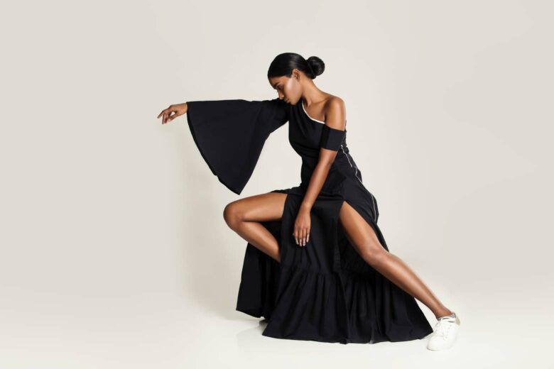
Match colors to your skin tone
Just like some colors work better together than others, some colors work better with certain skin tones. But remember, there’s no rule to fashion. And if you find that your favorite color actually isn’t doing you justice, you could still use it as an accent.
Determining your skin undertone
First things first: in order to match your clothes to your complexion, you have to know what skin undertone you have. Quite simply, skin undertones can be compartmentalized into warm tones, cool tones, and neutral tones. This isn’t necessarily linked to how dark or light your skin is, but rather what colors come through your skin from underneath the surface.
Warm tones vs cool tones
If you have greenish, yellowish or golden undertones, your skin tone is warm. People with warm skin tones typically have brown, amber or hazel eyes. And their hair is likely to have hints of red, copper or gold tones.
If you have bluish undertones, your skin tone is cool. This group ranges from very fair to very dark and can be recognized by ash undertones in varied hair colors. There is also a chance that you simply cannot determine whether you have a warm or cool skin tone, in which case you are probably neutral.
Use the paper test
Besides analyzing your hair and eye color, the paper test is a simple way to determine which skin tone you have. Make sure your face is void of makeup and creams. And if you’ve just washed it, wait for any redness or irritation to subside.
Once your face is au naturel and ready to go, grab a white piece of paper and step into a space with natural lighting. Hold the piece of paper next to your face and examine the contrast. If it appears greenish, golden or yellow, your skin tone is warm. If it leans towards blue, pink or rosy, you can count yourself amongst the cool kids. And if you’re picking up grey or ashen undertones, you’re joining the neutrals club.
Examine your veins
The paper test can be ineffective with acne-prone skin or hot flushes. In this case, we recommend looking at your veins to determine your skin tone. Green veins are usually a sign of warm undertones, while blue veins are usually a sign of cool undertones. Again, if you can’t decide, your skin tone is probably neutral.
Think about how your skin reacts to the sun
Of course, to many of us, it’s pretty obvious what skin tone we have. Just think of how you react to the sun. If you tan easily, you probably have a warm skin tone. And if you burn easily, you likely have a cool skin tone. Somewhere in between? Yep, you guessed it—you’re neutral.
Colors for warm skin tones
Although there are very few colors that warm skin tones can’t pull off, warm on warm is a surefire way to look your best. Burnt oranges, mustard yellows and glitzy golds complement your warm undertones. Whilst brighter colors such as cherry red look fantastic against an olive skin tone. And fairer complexions with warm undertones should consider warmer versions of cool shades such as greys or olive greens.
When it comes to a dark color palette, look for earthy tones such as rich chocolate browns and be slightly more cautious when it comes to black. Yes, everyone can wear black, but warmer skin tones should stick to slick, graphic iterations as black could potentially highlight wrinkles and imperfections when worn too close to the face.
Colors for cool skin tones
If you’re cool: you look cool in cool. That shouldn’t be too difficult to remember right? Soft blues, pinks, and purples epitomize elegance when set against a cool skin tone. Whilst darker hues such as black, navy, and charcoal can look incredibly striking. Strong colors such as electric blue and grass green can make a cool skin tone appear paler—but if you’re not worried about that then go for it.
In general, pastels bring a softness to the silhouette. Whilst lighter neutrals such as beige or champagne or stone do little to highlight the skin’s natural radiance. Therefore if you’re opting for neutrals, look at a dark color palette including browns, camels, and khakis.
Colors for neutral skin tones
You’re hot and you’re cold—if you’re confused about which skin tone you have, it’s likely to be neutral. And just like warm colors compliment warm skin tones and cool colors compliment cool skin tones, neutral colors harmonize beautifully with neutral skin tones. Shades that fall in the middle of the color spectrum—such as beige and taupe—are a fail-safe choice. Whilst light peach, dusty pinks, peony pink, placid blue, jade green, and cameo are the perfect way to add some color to your wardrobe without overpowering your look.
Stylists typically suggest that neutral skin tones steer clear of anything too bright and opt for softer colors instead. But again, that’s just a guideline and if you feel fantastic in red—we say go for it.
Colors for everyone
Thankfully there are those miracle-working hues that bring out the best in everyone. These shades typically have a perfect balance of warm and cool undertones and as a result, don’t clash with warm or cool skin tones. Take note for the next time you’re gift shopping. You can’t go wrong with them.
A clean white looks fantastic against every skin tone, but be sure that it is void of warm or cool undertones. A light blush pink adds a natural glow. Teal perfectly marries blues and greens and can be worn by anyone throughout Winter or Summer. While eggplant purple acts as a dark neutral and accentuates any look without overpowering it.

10 good color combinations for men and women
Perhaps you’re figuring out what hues to add to your wardrobe. Or perhaps you have a wardrobe full of colors but are reticent to try out new color combos. We’ve all been there. Days are busy. Decision-making is never-ending. So hopefully these stylist-approved color combinations will reduce decision fatigue and freshen up your everyday look.
Classic color combinations: Sophisticated and timeless
Navy and White
Navy and white: it’s clean, sleek, and super chic. Think of an oversized navy blazer paired with a ruffled white blouse and denims. Or think of your classic Breton striped navy and white sweatshirt. Navy and white is close to black and white, maintaining an almost all-neutral aesthetic. But the subtle blue undertones soften the look—especially against warm skin tones.
Meghan Markle’s navy and white oversized coat is a fantastic example of how to wear the classical color combination. Whilst navy and white polka dots are Kate Middleton’s go-to. And any version of navy and white color combination is good for men—be it navy trousers with a white shirt or white trousers with a navy blazer.
Black and White
Understated yet perfectly contrasted, black and white ensembles give off an effortless elegance. The color combination highlights your natural radiance without stealing the show. And whilst it certainly passes any formal dress code, it does so with a modern minimalist attitude.
Black and white combo lends itself to street style getups, sophisticated soirees and everyday office wear alike. That being said, we love a graphic tee paired with distressed denims just as much as we adore an oversized black blazer with black skinny jeans and a white tee or a classical houndstooth coat.
Khaki + Beige
If the first thing that pops to mind is a ranger’s uniform—we’re here to redeem that. Whilst khaki and beige color combo is no doubt the unofficial safari uniform, it can also be a great style match when dressed well.
Paired together the neutral colors give off an earthy, natural feel that can be worn time and time again without feeling overworn. We particularly love a Khaki coat paired with beige denims. And beige knits paired with khaki bottoms is the perfect relaxed yet refined Winter ensemble.
Grey and Black
Dressing greyscale is the perfect excuse to explore with different textures, fits, and fabrics without feeling OTT. Found those skin-tight black leather pants that you bought for a Grease themed party? Try pairing them with a casual grey sweatshirt for a look that is casual yet undeniably chic.
Itching to wear your 90s-inspired white paperbag pants? Reach for a black polar neck and elongated grey coat to maintain an air of understated sophistication.
Brown and Burgundy
Brown and burgundy: we can already see the leaves changing color and beginning to fall. A deep rich burgundy or maroon often looks fantastic against warm and cool skin tones. But it can be difficult to style and has the propensity to look old-fashioned or outdated.
To keep your burgundy go-tos looking fresh and Y2K-approved, we recommend pairing them with dark browns. Brown chinos, skirts or trousers soften burgundy knits and tops. And a vintage-inspired burgundy dress looks amazing with a brown trench and boots.
Trending color combinations: Confident and in-the-know
Pink + Purple
Barbie is back! With Y2K fashion taking over our Instagram feeds, it’s clear that pink and purple color combos are no longer confined to doll houses and Katy Perry music videos. The sugary-sweet color scheme has been adopted by many of our favorite style icons. And whilst it is inherently fun and feminine, it can also be incredibly striking and serious.
When it comes to pairing, we recommend starting with pink or purple and accenting it with the other. A regal purple satin jumpsuit with bright fuchsia detailing is bound to rake in the compliments. While a light pink men’s shirt with dark purple florals is playful yet easy to wear. Personally, we’re tickled pink by the idea.
Green + Black
Green and black: it ticks all our boxes. And clearly, every A-lister agrees. This color combination is the perfect way to add a pop of color to your wardrobe, whilst maintaining a sleek aesthetic. Use a vibrant green to spice up an all-black ensemble. Or balance the two in perfect harmony. There are really few rules when it comes to this color scheme.
That being said, we’re giving you full license to go bright when picking your green. In fact, we say the brighter, the better. Think Bottega Veneta’s infamous Kelly green hue or Rihanna’s infamous green faux fur coat.
Red + Black
Somewhere between neutral and dare-devil valiance, red and black is a timeless color combination that is also totally on-trend. The look is inherently empowering as the boldness of a bright red is grounded by the sophistication of the stark, dark hue. And together, they exude confidence and positivity.
Not ready to go all the way? Try accenting your LBD with red kitten heels, a red lip, red nails or a red bag. But if you’re feeling bold, a long red coat is always a good investment.
Orange + Cobalt Blue
Color blocking is trending. But color blocking with orange and blue is trending even more. As complementary colors on the color wheel, the two hues contrast and highlight each other perfectly.
The look can be too much for many. But you can easily tone it down with muted shades or subtle accents. For example, burnt orange and cobalt blue are striking but sophisticated. While vibrant orange accessories and prints work fantastically with a striking cobalt blue outfit.
Lemon Yellow + White
We feel happy just thinking about it. Reminiscent of citrus cocktails and marigold flowers, lemon yellow and white are the colors for Summer.
A yellow and white print instantly enhances sun-kissed skin, making it the perfect choice for maxi dresses and cotton shirts. While a casual yellow tee and white shorts are an easy-to-wear option for men. And if you’re looking for something more sophisticated, we say stick to white and accent the ensemble with lemon-yellow details.

How to choose a color palette for your capsule wardrobe
It’s all about mixing and matching.
Base Colors + Accent Colors
To start off a capsule wardrobe, you want to look for uniform colors that work well together. The easiest way to do this is to start with neutral base colors and then add brighter accent colors or “pops of color.” When considering your base colors, you may want to take your skin tone into consideration. So if you have a warm skin tone, start with warm neutrals such as camels, browns, ivory, and burgundy. If you have a cool skin tone, opt for cool neutral base colors such as greys, black, and navy. And if your skin tone is neutral, you could look at neutrals in the middle of the spectrum such as beige, taupe, and peach.
Most neutral base colors go well with anything. So from there, you can simply choose which colors you want to accent with. Think Gen Z greens, Millennial pinks and cobalt blues—when it comes to accents, the sky’s the limit.
Patterns, Prints, and Textures
The key to a good capsule wardrobe is how interchangeable the combinations are. Do most of your bottoms work well with your tops—and visa versa? Of course, the simplest way to achieve this is to stick to solids. But that’s no fun, especially if you’re a big fan of prints.
The good news is that you don’t have to neglect prints altogether, you just have to determine how to make them work. One way to do this is to keep either your bottoms or your tops solid. That way, if you have a cupboard full of printed shirts, they’ll combine easily with all your solid bottoms. And if printed skirts or shorts are your thing, solid tops make them effortless to pair. Another way to incorporate prints is to only include prints that work together. For example, stripes can often be worn with florals or plaids.
Frequently asked questions about clothing color matching
No matter how beautiful the design of a garment is, colors hold the power to accentuate or spoil its beauty. Colors that clash next to each other are jarring to look at. Whilst colors that harmonize together, are pleasing to the eye, leaving a lasting impression on those we interact with.
The color wheel is an excellent tool for determining which colors work in harmony and which don’t. It sets guidelines that make assembling new outfits a lot easier, especially if you don’t trust your intuition. For example, if you prefer understated looks, pairing analogous colors together is a failsafe method. And if you’re into bolder styles, the color wheel points to complementary colors that contrast each other beautifully.
When choosing a color scheme for your clothes, look to your skin tone and color theory for guidance. Or pick colors according to the color wheel. Check out our guide to color matching for inspiration on how to choose a color scheme for your outfits.
Neutrals are often thought of as being the most classy. And different neutrals styled together are one of the simplest ways to look sophisticated. However, all colors are classy when paired with other colors that work well together. To know whether your colors work well together, see our full guide to clothing color matching.
